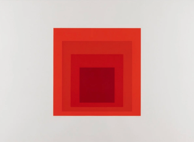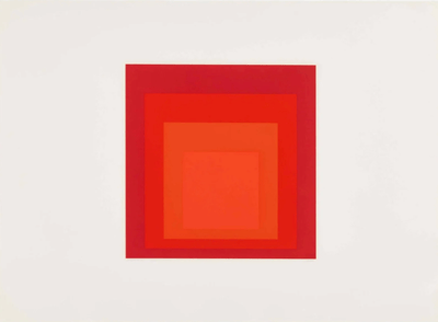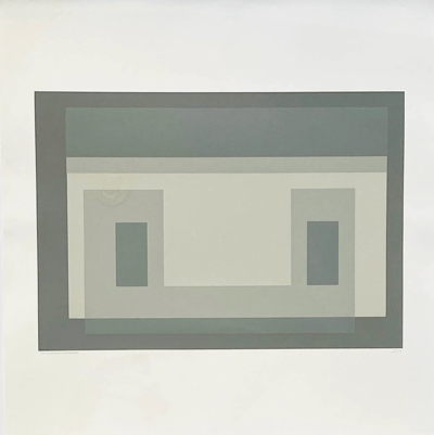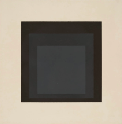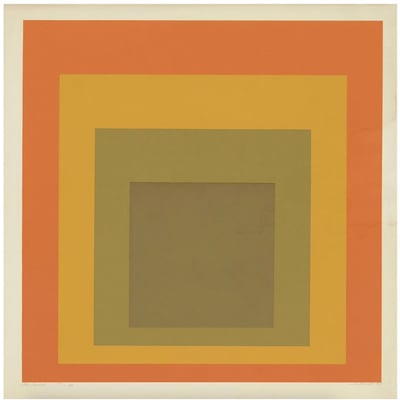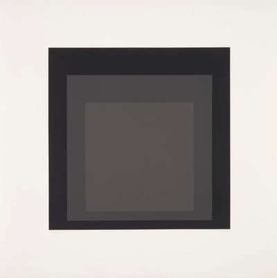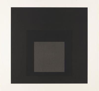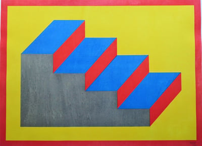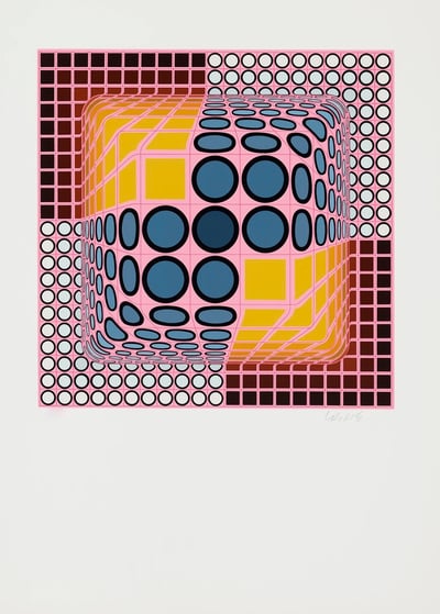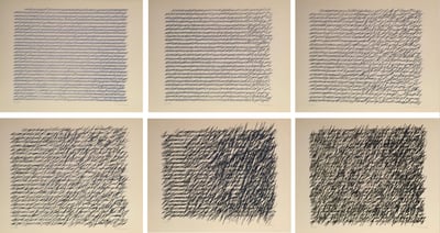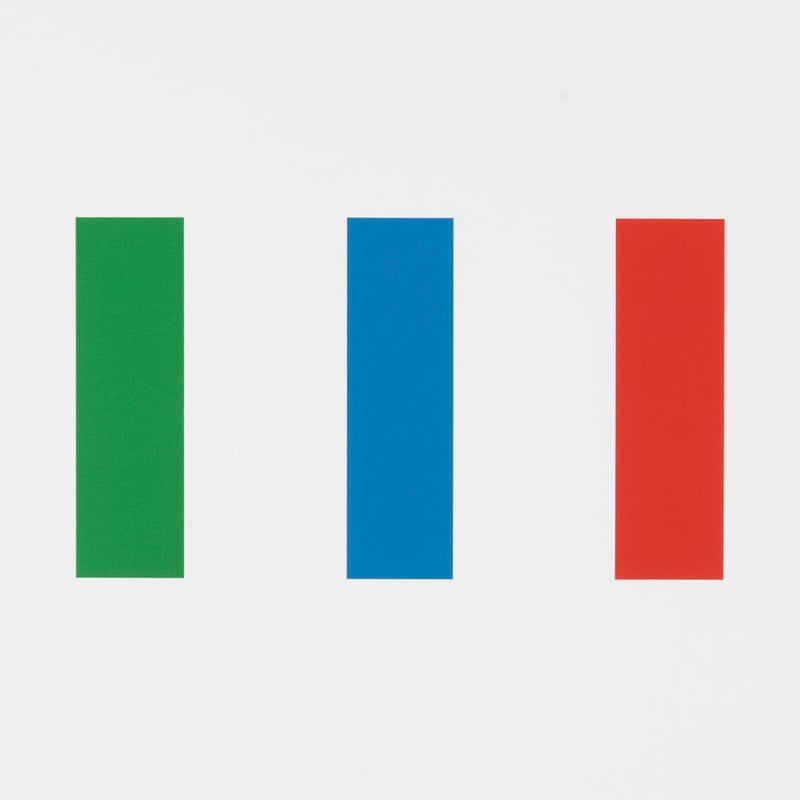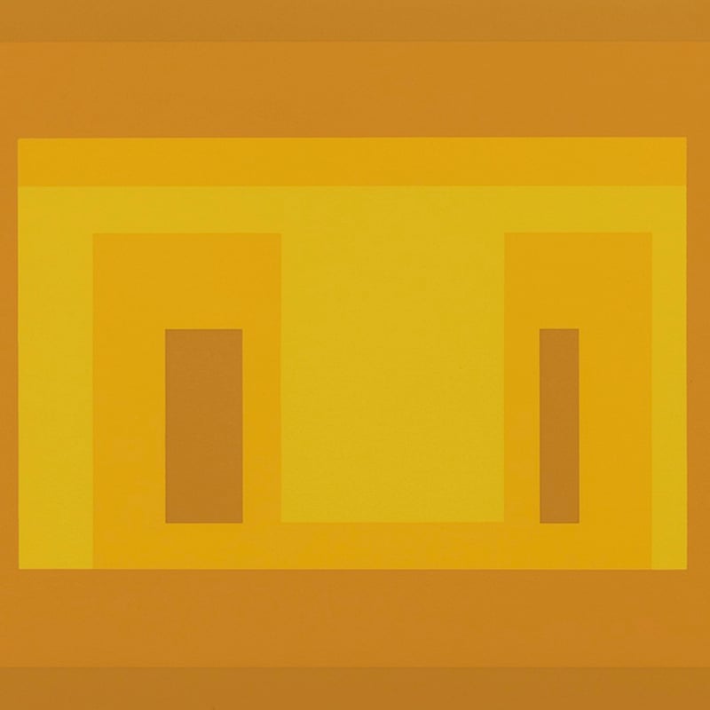
From Six Variants - Original Screenprint in colors - Published by Ives-Sillman Inc. New York
- Hand Signed Dated Numbered and Titled in pencil
- Danilowitz 192.3
I-S Va 3 by Josef Albers, a 1969 screen print, exemplifies the artist's mastery in exploring geometric abstraction and color interaction. Part of the Six Variants series, this composition uses overlapping rectangles in shades of teal, brown, and grey to create a sense of depth and spatial harmony. Albers' careful layering and color choices demonstrate his fascination with how colors influence one another, inviting viewers to perceive subtle shifts in hue and dimension. Published by Ives-Sillman Inc. in New York, this limited edition print captures Albers' dedication to the study of form, balance, and visual perception.
Josef Albers (Germany/USA, 1888–1976) was a groundbreaking artist, designer, and educator central to the Bauhaus movement and modern art. Known for his Homage to the Square series, he explored color theory and perception. Albers’ teachings and writings, like Interaction of Color, have profoundly influenced contemporary art and design education.
Screen-printScreen printing is a technique where ink is transferred through a mesh onto a substrate, with areas blocked by a stencil to prevent ink from passing through. This method, also known as serigraphy or silkscreen printing, is commonly used to produce prints on posters, T-shirts, vinyl, stickers, wood, and other materials. The process is a type of stencil printing, allowing for vibrant, detailed designs on various surfaces.
From Six Variants - Original Screenprint in colors - Published by Ives-Sillman Inc. New York
- Hand Signed Dated Numbered and Titled in pencil
- Danilowitz 192.3
I-S Va 3 by Josef Albers, a 1969 screen print, exemplifies the artist's mastery in exploring geometric abstraction and color interaction. Part of the Six Variants series, this composition uses overlapping rectangles in shades of teal, brown, and grey to create a sense of depth and spatial harmony. Albers' careful layering and color choices demonstrate his fascination with how colors influence one another, inviting viewers to perceive subtle shifts in hue and dimension. Published by Ives-Sillman Inc. in New York, this limited edition print captures Albers' dedication to the study of form, balance, and visual perception.
Josef Albers (Germany/USA, 1888–1976) was a groundbreaking artist, designer, and educator central to the Bauhaus movement and modern art. Known for his Homage to the Square series, he explored color theory and perception. Albers’ teachings and writings, like Interaction of Color, have profoundly influenced contemporary art and design education.
Abstraction is real, probably more real than nature.
- Josef Albers
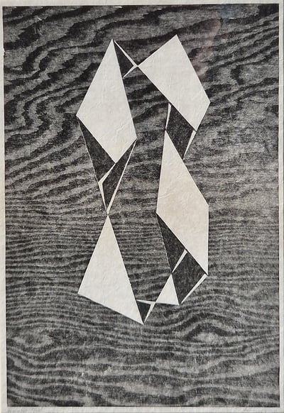
Often cited as one of the founders of minimalist and conceptual art, Josef Albers is widely acclaimed for his theoretical teachings on art and his interplay between shape and colour. Among his most recognised works, Homage to the Square is a series which spanned across the 50’s and the 60’s, and features a range of rigid, geometric productions applied to canvas, all of which were offset by whichever colour palette he had chosen to adopt – the combination of the geometry and colour creates various optical effects, for which Albers has become renowned. Albers has stated ‘abstraction is real, probably more real than nature’ - his work is an attempt to portray this philosophy, and he challenges the viewer to analyse their own perspective with each piece; Structural Constellations is perhaps is most celebrated work of this kind, a subtle piece composed of simple lines that combine to create illusory forms. (Artist website)
Abstract art uses form, shape, line, and color to create a visual experience without attempting to represent external reality. The composition exists independently of the world's visual references, focusing on expressing ideas and emotions through non-representational means.